Discover the Top 15 Fonts for Sign Design
Today, I want to share with you the ultimate guide to the best fonts you can use for your signs. When it comes to design, choosing the right font is crucial to conveying your message effectively. So, let’s dive right in and explore the top 15 sign fonts that will make your signs stand out from the crowd!
1. Helvetica: Clean and modern, Helvetica is a timeless classic that exudes simplicity and professionalism.
2. Bodoni: If you’re looking to add elegance and sophistication to your signs, Bodoni is the way to go. Its thin, serifs give it a touch of class.
3. Chalkboard: Want to create a nostalgic and rustic vibe? Chalkboard fonts are perfect for that vintage feel. Just imagine your sign as if it were written on an old-school blackboard.
4. Gotham: Sleek and stylish, Gotham is a versatile font that blends well with any design. It’s clean, yet distinctive, making it a popular choice for many brands.
5. Scriptina: If you’re aiming for a more artistic and whimsical look, Scriptina is a fantastic choice. Its flowing and cursive style adds a touch of playfulness to your signs.
6. Futura: Modern and geometric, Futura is a font that screams innovation. Its minimalistic design makes it perfect for conveying a sense of forward-thinking.
7. Comic Sans: Known for its informal and friendly appearance, Comic Sans is a font that captures attention. While it may not be suitable for all purposes, it can be effective in certain settings.
8. Impact: When you want your message to pack a punch, Impact is your go-to font. Its bold and condensed style demands attention.
9. Brush Script: Looking for a font that feels handmade and personalized? Brush Script is just what you need. Its brushstroke-like appearance adds a touch of authenticity to your signs.
10. Verdana: Clean, readable, and versatile, Verdana is a font that works well in any setting. Its simplicity makes it an ideal choice for conveying important information.
11. Avenir: Avenir is a well-balanced font that combines modernity with elegance. Its rounded letterforms give it a friendly and approachable vibe.
12. Old English: Want to add a touch of medieval charm to your signs? Old English is the font for you. Its ornate and decorative style brings a sense of history and tradition.
13. Garamond: Classic and timeless, Garamond is a font that never goes out of style. Its elegant and legible design makes it a favorite for formal settings.
14. Helvetica Neue: A refined version of the classic Helvetica, Neue offers a fresh take on a beloved font. Its clean lines and balanced proportions make it a versatile choice.
15. Cooper Black: If you’re going for a bold and eye-catching look, Cooper Black is the font you’re looking for. Its thick letterforms make a strong statement.
And there you have it! The top 15 fonts for sign design. Whether you’re aiming for professionalism, nostalgia, or creativity, these fonts have got you covered. So go ahead and choose the perfect font for your signs, and let your message shine!
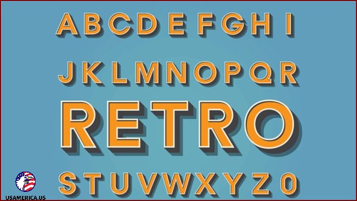
If you buy somethin’ through our links, we might earn some money from our partners. Learn more.
Picking the right font for your business sign is a super important step on the road to success. Your sign not only grabs people’s attention and welcomes ’em in, but it also represents your brand’s identity. Just as important as the words themselves, the font you use needs to stand out and be easy to see.
It should clearly show the message and emotion you want to convey. But what are the best font choices for signs? In this guide, I’ll explore the top sign fonts that businesses can use.
Contents
- 1 What Fonts are Used for Signs?
- 2 Choosing the Perfect Font for Your Small Business Sign
- 3 What to Consider When Choosing a Sign Font
- 4 How I Chose the Best Sign Font Options for Business Signs
- 5 Top Sign Fonts to Make Your Display Stand Out!
- 5.1 1. Alchemist Serif Font
- 5.2 3. Raidland – Brush Script Font
- 5.3 Now, let’s move on to our next topic: the Request – Display Font.
- 5.4 5. Discover the Tahoe Font
- 5.5 6. Futura PT Font
- 5.6 7. Classic Comic Sans Serif Font
- 5.7 8. Visia Pro Font
- 5.8 9. Bebas Neue Pro Font
- 5.9 10. Vanguard Font
- 5.10 11. Meet the San Marino Urban Font
- 5.11 12. LTC Bodoni 175 Font
- 5.12 13. Proxima Nova Font
- 5.13 14. ATF Garamond Font
- 5.14 15. The Myriad Pro Font
- 6 Comparing the Top Sign Fonts
- 7 Quick Tips for Matching Fonts on Websites and Signs
- 8 What’s the Best Font for Signs?
- 9 What Are the Best Professional Fonts for Signs?
- 10 Which sans serif fonts are the best for signs?
- 11 What’s the perfect font for a big sign?
What Fonts are Used for Signs?
Do you ever wonder what font is used for signs? Well, there are a bunch of different fonts to choose from, but some are more popular than others. Whether you hire a professional or make your own business sign, here are some fonts that work really well for big signs:
- Helvetica
- Futura
- Bebas
- Proxima Nova
- Avenir
- Optima
- Myriad

Choosing the Perfect Font for Your Small Business Sign
So, you’re wondering how to pick the best font for your small business sign, huh? Well, don’t worry – I’ve got you covered. While there are tons of fonts out there, not all of them are great for signs. Lucky for you, I’ve got some tips to help narrow down your options.
First things first, think about what you want your sign to achieve. Is it supposed to grab attention? Convey a specific message? Once you know your sign’s purpose, it’ll be easier to find a font that fits the bill.
Next, consider who you’re trying to reach with your sign. Different fonts appeal to different people, so it’s important to know your audience. Are they young and trendy? Traditional and sophisticated? This will help you choose a font style that resonates with your target market.
Visibility is another crucial factor. Depending on where your sign will be displayed, you need to make sure it’s readable from different distances. That fancy script font might look beautiful up close, but if it’s hard to read from far away, it won’t do you much good.
Last but not least, think about how your font complements your brand’s visual identity. Your sign should be an extension of your brand, so it’s important to choose a font that aligns with your existing aesthetic. This creates a consistent and cohesive look across all your marketing materials.
Get to Know Different Font Categories
When it comes to choosing fonts, there are thousands to pick from. However, most fonts can be categorized into a few different types, each with their own strengths and best uses.
Understanding the differences between serif, sans serif, script, and novelty fonts can help you find the perfect lettering for your own displays. Sans serif fonts are great for big signs because the letters are clear and sharp, even from far away.
On the other hand, serif fonts work well for businesses that want a more traditional or elegant feel. And if you run a creative business, using script fonts can add a personal touch to your designs.
Don’t Forget about Your Brand Guidelines
When I create signs, posters, and other display advertising, it’s super important to follow a brand’s style guidelines. You see, a brand is how a company is remembered by customers, and if I design a sign that looks different, it won’t do a good job of promoting the brand.
If you’re having trouble finding a font that matches the brand’s logo and style, try to pick one that’s at least in the same font family or one that compliments it. When all the visual elements of a brand work together, it makes the brand’s identity stronger and helps customers remember it better.
Think About How the Sign Will Be Used
So, how will the sign be used? If it’s for a small business, the font I choose might be different if it’s going to be looked at up close versus from far away.
When choosing a font for a sign, it’s important to think about where the sign will be displayed. Different communities and areas have specific requirements for fonts and text sizes in certain locations.
Don’t forget that if you plan to showcase your sign on a website, the World Wide Web Consortium recommends a contrast ratio for large-scale text.
Think About How You Use Capitalization
Some fonts look stronger when used with traditional sentence or title capitalization, while others work better in all-caps. So, it’s important to consider how you want to use capitalization when choosing a font for your sign.
For large outdoor signs with short messages, capitalized letters are often the best choice. But if you have more text or a smaller sign, using title or sentence capitalization makes it easier to read.
When it comes to your sign, the way you capitalize your text can make a big difference in how easy it is to read and how much impact it has. That’s why it’s important to try out different capitalization styles to find the best way to present your message.
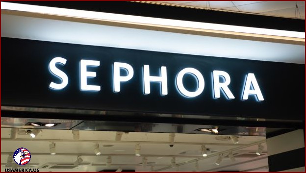
What to Consider When Choosing a Sign Font
When it comes to choosing a font for your sign, there are a few important things to keep in mind. Let me share with you the key considerations:
- Readability: It’s crucial to choose a font that is easy to read, especially from a distance and in different lighting conditions. Be mindful of the size of the text and the spacing between letters and words. You want your message to be clear and legible.
- Brand Consistency: Your sign should reflect your brand’s style and aesthetics. It’s important to select a font that aligns with your existing branding and complements your logo and other marketing materials. Consistency is key to maintaining a cohesive and recognizable brand identity.
- Sign Usage: Consider where and how your sign will be used. Is it going to be placed indoors or outdoors? Is it meant to provide information or promote something? The font style should be adapted accordingly to suit the purpose and location of the sign. Additionally, keep in mind the duration of the sign’s display – whether it’s temporary or permanent.
By considering these factors, you can make an informed choice and ensure that your sign effectively communicates your message while reflecting your brand identity. Happy font hunting!
When deciding on a font for your sign, think about whether you want it to have a classic, modern, fancy, or unique look. Use bold or italic styles to draw attention to important information.
To make sure your sign is easy to read, use colors that have a high contrast. This means choosing a font color that stands out against the background. For signs that need to be seen from far away, go for thicker and bolder fonts.
Think about the type of place your sign will be in and the people who will see it. Different fonts can give off different vibes, so make sure your choice matches the setting. For example, a fun and playful font might not be appropriate for a serious or professional environment. It’s also important to check if there are any rules or cultural norms about fonts for public signs in your area.
As a writer, it’s important to consider how fonts look when they’re scaled up for bigger signs. To make sure that your text is easy to read and still looks good on large formats, you should choose fonts that maintain their integrity. This means avoiding fonts with intricate details that might get lost when the text is enlarged.
How I Chose the Best Sign Font Options for Business Signs
When picking a font for a business sign, I made sure to consider how it would affect readability, brand perception, and the overall impact of the sign. Here’s how I went about choosing the best sign font options suitable for different types of business signs:
Readability and Visibility (10/10)
The most important thing to consider is how easily people can read the font from different distances and angles. I made sure to choose clear and legible fonts to ensure that the sign’s message is understood quickly by viewers.
Versatility and Scalability (9/10)
A font’s clarity and visual appeal when scaled to different sizes are vital. This ensures that the sign remains effective whether it’s seen up close or from far away.
Uniqueness and Memorability (8/10)
When I search for fonts, I want ones that really grab your attention and leave a lasting impression. But I don’t like fonts that are too fancy and hard to read. I prefer ones that strike a balance between being stylish and clear.
Now let’s talk about color compatibility. Fonts need to work well with different colors and backgrounds so that they can be used in all kinds of signs. This way, they can be easily seen and read in different lighting conditions. I think it’s important for fonts to be flexible like that.
Speaking of being adaptable, a good font should be able to work well in different types of media. It should be suitable for digital advertising as well as print materials. This kind of consistency helps maintain a strong brand image.
When considering fonts, I also think about how timeless they are. I like fonts that have a timeless quality. They don’t go out of style quickly and remain effective and appealing over time. I try to avoid fonts that are too trendy and may not age well.
Lastly, let’s talk about licensing and usage rights. It’s important to choose fonts that we can use legally and according to their licensing terms. We want to make sure we have the right to use the fonts in our projects and that we’re not infringing on any copyrights.
So, in summary, I look for fonts that make a statement without sacrificing clarity. They should work well with different colors and backgrounds, be adaptable across different media, have a timeless quality, and be properly licensed for usage.
When choosing fonts for commercial use, it’s really important to pick ones that are allowed legally, considering the terms of the license and any fees that may be involved.
Fitting the Culture and Context (6/10)
It’s also important to choose a font that suits the specific audience and industry of the business, thinking about cultural and contextual factors.
Design that Lasts (6/10)
Thinking about how long the font style will withstand wear and tear, especially for physical signs exposed to the elements, is a key consideration.
Customization Possibilities (6/10)
Fonts that offer customization options allow businesses to make small changes and create a more unique look.
Advice from Designers and the Industry (6/10)
When it comes to choosing the best sign fonts for business signs, I take into account the opinions and recommendations of experts in the design and industry fields. This way, I can make sure that the options I select are widely accepted and effective.
My method for selecting these fonts is designed to help businesses make the right choices for their signage. I focus on three important factors: readability, versatility, and overall visual appeal. By considering these aspects, I aim to find practical and suitable font options that can positively contribute to a wide variety of businesses’ visual marketing efforts.

Top Sign Fonts to Make Your Display Stand Out!
When it comes to selecting the perfect font for your signs, you might be overwhelmed by the countless options available. How do you make the right choice? Where can you find the best fonts for your displays?
Well, look no further! I’ve got you covered with a list of some of the most amazing font styles from top font websites like Adobe and Envato Elements. These fonts are guaranteed to make your signs pop and grab attention. Check out these font examples:
1. Alchemist Serif Font
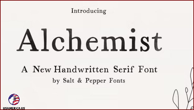
I’ve got to tell you about this amazing font I found. It’s called Alchemist Serif, and it’s available on Envato Elements and other places too. This font has a lot in common with the classic Times New Roman, which gives it a really clear and unique look. You can use it in any size you need, and there are different options for spacing as well. Isn’t that awesome?
Now, let me introduce you to another great font called Etna Sans Serif. It’s a font that doesn’t have any fancy lines at the ends of the letters. But don’t let that fool you, because Etna Sans Serif still has a ton of style. You can use it for all kinds of things, like headlines or even body text. The possibilities are endless!
I hope you’re as excited about these fonts as I am. They’re both so versatile and have their own special charm. So go ahead and give them a try. I promise you won’t be disappointed!
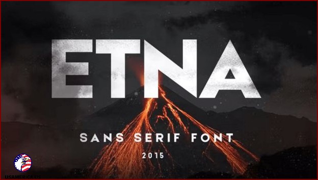
I’ve got some cool stuff to share with you. You know, Envato Elements is a really awesome source for finding all kinds of amazing things, including fonts. And let me tell you, they have this font called Etna that is absolutely stunning! If you want to grab people’s attention with your signs, this is the font for you. It’s a sans serif font that was specifically created to look super sharp and beautiful on big signs and displays.
3. Raidland – Brush Script Font
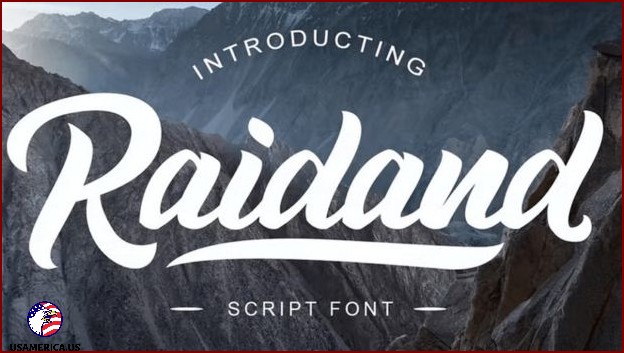
Today, I want to talk about something cool – script fonts! Now, usually, script fonts aren’t the best choice for signs. But hey, there’s always an exception to every rule, right? And that exception is the Raidland brush script font!
This font is something special. It has a clean and sleek style that makes it perfect for logos and posters. And guess what? It’s even readable from a distance! How awesome is that?
Now, let’s move on to our next topic: the Request – Display Font.
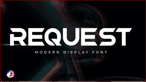
If you’re looking for a font that demands attention and delivers a strong message on big signs, look no further than Envato Elements. They’ve got the Request display font, a bold choice that uses abstract elements to stand out and grab your eye in all sorts of ways.
5. Discover the Tahoe Font
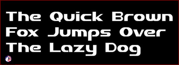
I’ve got another awesome font to show you, this time from Envato Elements and some other sources. It’s called Tahoe font, and it’s really unique. It has a clean and modern look with no fancy swirls or curls. Perfect for big and bold text like logos, headlines, and large signs.
6. Futura PT Font
Oh, Adobe is also a great place to find cool fonts for big signs. One of their popular choices is the Futura PT font. It’s been around for almost a hundred years, can you believe it? And people still love it because it’s simple, easy to read, and looks great on signs.
7. Classic Comic Sans Serif Font
So, I’ve heard a bunch of people saying that using comic fonts for signs isn’t the best idea. But you know what? I beg to differ! I think Adobe’s Classic Comic sans serif font is a great option for signs, especially when you want something different from the usual fonts. This font has darker lettering compared to other modern comic fonts, which means it can catch people’s attention even from a distance.
8. Visia Pro Font
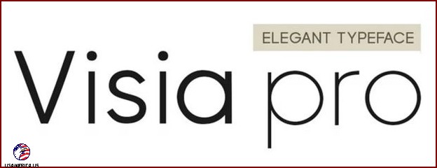
Are you searching for a font that really catches your eye when used on light backgrounds? Well, let me tell you, finding the perfect font can make a big difference in your signage designs. Lucky for you, you can find the Visia Pro font on Envato Elements and other sources. This font is super clear and crisp, so you can be sure your message will come across loud and clear.
9. Bebas Neue Pro Font
Have you heard of the Bebas font family? It’s a popular choice for signs because it’s so easy to read. And now, Adobe has taken things up a notch with the release of Bebas Neue Pro fonts. This amazing font not only includes uppercase letters but also lowercase letters, italics, and even Cyrillic characters. Talk about versatility!
10. Vanguard Font
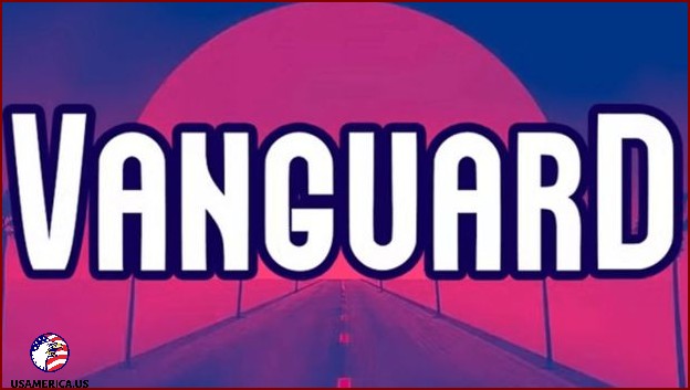
You won’t forget the bold and eye-catching Vanguard font, which you can find on Envato Elements and other places. It’s perfect for making a powerful impression on any big sign. Vanguard is a fancy font without those little lines at the end of letters, making it ideal for showing clear and straight-to-the-point messages on signs. And the best part? It gives signs a stylish and modern look.
11. Meet the San Marino Urban Font
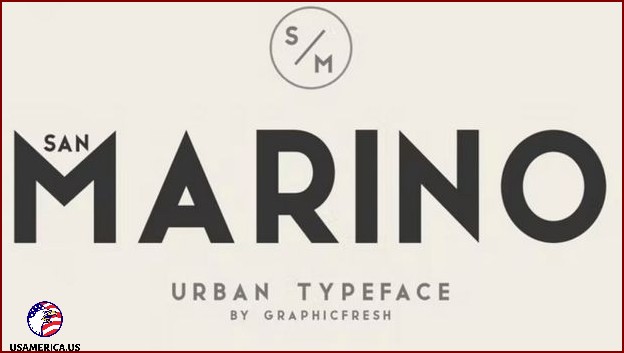
Let me tell you about another awesome font you can find on Envato Elements. It’s called the San Marino font, and it’s part of the urban typeface family. This font really stands out among the many bold fonts out there. When it comes to sign fonts, the San Marino font checks all the boxes. It’s bold, clear, and has a modern vibe that gives it great readability no matter how far away you are.
12. LTC Bodoni 175 Font
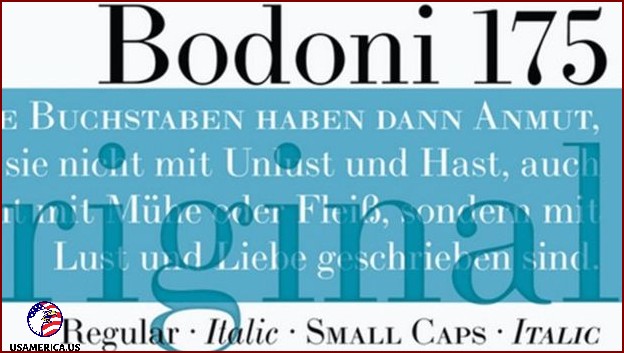
I really like the Bodoni font. It’s a font type that’s popular for all kinds of signs – big and small. The strokes of the letters are so smooth, and it has a little bit of a serif which makes it stand out while still being easy to read. Adobe has a font called LTC Bodoni 175 that’s a modern take on this type of font.
13. Proxima Nova Font
I want to tell you about another font called Proxima Nova. It’s a classical san-serif typeface, which basically means it doesn’t have those little feet on the letters. It’s considered one of the best fonts for websites, so if you have a small business and want your website and signs to match, this could be a great choice. Adobe has different versions of the Proxima Nova font in different weights, so you can customize it to fit your style.
14. ATF Garamond Font
Why is Garamond one of the best fonts for signs, even though it has serifs? Garamond is a popular choice for emphasizing smaller sign features like descriptions and labels. The ATF Garamond font, which you can find on sources like Adobe, is great for fine details. However, when it comes to titles and headlines, you should opt for a different font.
15. The Myriad Pro Font
The Myriad Pro font, created by Adobe, is a favorite among display fonts and is considered one of the best fonts for signs. It’s so popular that Apple often uses it for their displays, including their famous logos. Myriad Pro works well for both headlines and smaller text.
Comparing the Top Sign Fonts
This table provides a comparison of the 15 best sign font options. It outlines their unique features and suggests ideal scenarios for using each font. With this information, you can easily choose the perfect font for your signage needs.
Quick Tips for Matching Fonts on Websites and Signs
- Make sure to use the same font on all platforms to keep your brand looking consistent.
- Choose fonts that are easy to read both online and in print.
- Think about the font’s style and the emotions it conveys to find the perfect match for your brand.
What’s the Best Font for Signs?
There are many great fonts for signs, like Helvetica and Bodoni, but one of the best choices is probably Futura. It has a clean, geometric design that makes it easy to read, no matter the size of the text. That’s why it’s so popular for big signs with lots of different words.
What Are the Best Professional Fonts for Signs?
- Helvetica
- Bodoni
- San Marino
- Visia Pro
Which sans serif fonts are the best for signs?
- My top picks for sans serif fonts for signs are:
- Classic Comic sans
- Etna sans serif
- Proxima nova
- Futura PT
What’s the perfect font for a big sign?
When you’re choosing a font for a large sign, the most important thing is to make sure it’s easy to read from a distance. That’s why you should go for a sans serif font. These fonts have a clean and simple style that makes them great for this purpose.
There are a few specific fonts that work really well for big signs. Arial, Helvetica, and Bebas are some of the best options out there. These fonts are known for their clarity and readability, especially in large print formats.
Experts in signage and visual communication recommend using these fonts in a bold and large type. That way, you can maximize visibility and make sure your message gets across loud and clear.
You should also try putting the text on a bright background to make it stand out more. This will make it easier to read and catch people’s attention.
Having a strong contrast between the text and the background not only looks nice, but also makes sure that the sign’s message can be easily seen from a distance. This is important for both people walking and driving by.
