10 Heat Map Tools and User Tracking Tools
Today, I’m going to share with you some awesome tools that can help you understand how users interact with your website. These tools can provide valuable insights into user behavior, helping you make informed decisions to improve your website’s performance.
1. Hotjar: Hotjar is a powerful tool that offers heat maps, click maps, and scroll maps. It also provides session recordings, allowing you to see exactly how users navigate through your site. With Hotjar, you can easily identify areas where users may be experiencing difficulties and make adjustments accordingly.
2. Crazy Egg: Crazy Egg is another popular heat map tool. It helps you visualize where users click on your website, providing valuable information about which elements are capturing their attention. This data can guide your design decisions and optimize your website’s layout for better user engagement.
3. Inspectlet: Inspectlet offers a wide range of user tracking tools, including heat maps, session recordings, form analytics, and more. With its comprehensive features, you can gain deep insights into user behavior and find opportunities for improvement.
4. Mouseflow: Mouseflow is a user tracking tool that offers heat maps, session replay, and conversion funnels. It provides detailed information about user interactions, allowing you to identify areas where users may be dropping off and optimize your website to increase conversions.
5. ClickTale: ClickTale enables you to analyze user behavior through heat maps, session replays, and form analytics. It helps you understand how users engage with your website, giving you the knowledge to enhance their experience and drive better results.
6. Heatmap.me: Heatmap.me is a simple and easy-to-use heat map tool. It allows you to visualize user interactions, including clicks, scrolls, and mouse movement. This data can help you identify patterns and optimize your website to increase user engagement.
7. Lucky Orange: Lucky Orange provides heat maps, session recordings, and live chat features. With its real-time insights, you can see exactly what users are doing on your website and address any issues or concerns they may have.
8. FullStory: FullStory enables you to watch session replays and analyze user behavior. It offers heat maps and click maps, helping you understand where users are most engaged and where improvements can be made.
9. Ptengine: Ptengine offers heat maps, session replays, and conversion funnels. Its user-friendly interface allows you to easily analyze user behavior and make data-driven decisions to optimize your website’s performance.
10. Smartlook: Smartlook provides heat maps, session recordings, and user journey analysis. It helps you understand how users navigate through your website and identify any pain points that may be hindering their experience.
So, there you have it! These 10 heat map tools and user tracking tools can give you valuable insights into user behavior on your website. By analyzing this data, you can make informed decisions to enhance user experience, improve website performance, and drive better results. Give them a try and see how they can take your website to the next level!
")
When it comes to business, us entrepreneurs are always trying to make sense of numbers and learn valuable things from them. With all the data we get from social media, customer interactions, and sales, it’s become really important for businesses of all sizes to manage and understand this information.
Using spreadsheets can give us the numbers, but they might not be the best way to see trends, patterns, and understand what’s going on. That’s where data visualization comes in handy! It’s basically using graphs, charts, or pictures to help us quickly see and understand the information and numbers.
As a data analyst, I can tell you that machine learning and statistics can give us valuable insights. But for those of us who aren’t experts, it can be hard to understand and share those insights without visualizing them. Our brains are wired to understand pictures and graphs much more easily than numbers and tables. That’s where heat maps come in.
Contents
What does a Heat Map do?
Did you know that heat maps are a different kind of analytics tool? They show data in a unique way that’s easy to understand. Basically, heat maps use colors to help us see clusters of information that have similar values. This can help us make better decisions by showing how different variables interact with each other. Instead of using numbers and charts, heat maps use colors to break down the information for us. Bright colors mean there’s a lot of activity, while cooler colors mean there’s less activity. Heat maps are great for showing patterns and changes across multiple variables.
Let’s talk about heat maps. They’re super cool because they take a bunch of data and turn it into a picture that’s easy to understand. Imagine you have a long spreadsheet with lots of numbers and information. It can be a bit overwhelming, right? Well, a heat map makes things way simpler. It uses different colors to show patterns in the data. So instead of staring at a sea of numbers, you can just look at the colors and instantly see what’s going on. This is really helpful because it saves time and lets you make connections between different parts of the data without getting too confused. Pretty neat, huh?
I’m here to tell you all about heat maps! They’re a really handy tool for figuring out how different parts of a company are performing. Plus, they help us figure out what we should prioritize and show us any areas we should be concerned about.
One great thing about heat maps is that they make our reports much clearer. They also make it easier for us to communicate with the people we need to talk to. And the best part? They help us engage with our target audience even more.
Unlike some other types of data visualizations, heat maps are super easy to understand. You don’t need to be an expert to figure out what they’re telling you.
Heat maps have become so popular that Google even created a heat map tool called Page Analytics. It’s a cool Chrome extension that lets you create heat maps using data from Google Analytics.
When Should You Use a Heat Map?
Heat maps are incredibly useful for showing how two things are related. They’re like a super handy tool that businesses use to understand sales, market intelligence, how people use a product, or financial reports. And the best part? They present all this information in a way that’s easy to understand and visually appealing. It’s like getting a valuable insight into your customers’ preferences, what makes them happy, and what doesn’t.
Designers, user experience specialists, and marketers totally rely on heat mapping to see how people are using websites. It helps them make smart decisions on how to improve the website so that more people buy stuff or become customers. And you know what that means? More money for the business!
Hey there, let me tell you about heat maps and how they can help you make sense of your website’s activity. You see, heat maps are like a secret superpower that uses colors and shades to show you which parts of your web page are getting the most action.
Imagine you have a fancy map that shows you where all the hotspots are – the places where people are clicking, scrolling, and engaging the most. And on the flip side, it also tells you where things have gone cold, like those areas that people are ignoring or not paying much attention to.
But how do heat maps work their magic? Well, they’re powered by special tools that keep track of what users are doing on your website. These tools gather all sorts of data, like where people are clicking, how far they’re scrolling, and what they’re paying attention to.
With this information, heat maps paint a picture of your website’s activity. They use vibrant colors to highlight the hotspots – those areas that are super popular and generating a lot of activity. And they use cooler shades to show you the areas that need a little love – the ones that people aren’t really giving much attention to.
So why is all of this important? Well, by using heat maps, you can see exactly where your website is succeeding and where it could use some improvement. You can focus your efforts on the hotspots, making them even hotter and more engaging. And you can give some extra attention to those colder areas, figuring out how to make them more interesting and enticing to your users.
So, if you want to understand how users are interacting with your website and optimize it for success, heat maps are the secret weapon you need. They’ll help you uncover valuable insights and make informed decisions about how to improve your online business.
Let me give you an example of how these tools can help you understand your website better. First, we have Scrollmaps. They show you which parts of your page are viewed the most. This can give you valuable information about what content is catching people’s attention and what might need improvement.
Next, we have Confetti. It’s like a colorful explosion of information! It displays all the clicks on your page and gives you details about each one. You can see where the clicks are coming from, whether it’s from a new visitor or someone returning to your site. This can help you understand what’s driving traffic to your page and how successful your marketing efforts are.
The Overlay tool takes it a step further. It shows you exactly how many people are clicking on each individual element on your site. This can be really useful for understanding user behavior and identifying any issues or areas of improvement.
Finally, we have the List. It helps you organize all the clicks you’ve gathered based on different factors. You can sort them by the type of page element, the number of clicks, and the percentage. This can give you a clear picture of what’s most important and where you should focus your attention.
All of these insights are like windows into your website’s performance. They can help you track what’s happening and find ways to make your business better. So take advantage of all these tools and start making smarter decisions for your website!
The best heat maps can help you analyze and understand how people use your website and apps. They give you valuable insights into user behavior and help you find areas for improvement. With heat maps, you can identify things like how far users scroll, how fast your site loads, any script errors, and bugs specific to different devices.
Tools for Heat Maps and User Tracking
If you’re doing marketing, heat maps are great for tracking how visitors interact with your website or apps. They provide a clear picture of your audience – who they are, where they’re from, how often they use your app, which features they prefer, and how long they spend scrolling through your site. These insights are invaluable for testing and improving your services for maximum impact.
Here are 10 heat map and user tracking tools you can use to research how your customers use your website and apps.
Crazy Egg
Crazy Egg is a really cool tool that helps companies understand how people use their websites. It uses different types of maps to show where users click, move their mouse, and scroll. It even has a special feature called the confetti map that shows exactly where people are clicking on your pages.
Crazy Egg also uses color-coded metrics to help you figure out where your website visitors are coming from and how they found your site. It even has a feature called A/B testing that lets you try out different elements on your site to see how people respond. This way, you can make smart decisions about what changes to make on your website.
Let me tell you about Crazy Egg, a powerful tool that helps you understand how people interact with your website. They have different plans to choose from, starting at just $24 a month. With the starter plan, you get 30,000-page view analysis every month and 100 recorded sessions. If you want something more robust, they have a plan that offers 500,000 analysis monthly and 1,000 recorded sessions, but it’s priced at $249 a month. Not sure if Crazy Egg is right for you? Don’t worry, they offer a 30-day free trial for all their plans.
Now, let me introduce you to EyeQuant.
EyeQuant is a cool tool that uses artificial intelligence to predict how users will react to your website designs. It provides instant feedback through a heat map, showing you areas that might need improvement like clarity and emotional impact. What’s great is that EyeQuant takes privacy seriously and complies with the General Data Protection Regulation (GDPR). They don’t have a fixed monthly subscription rate, but they can give you a customized quote based on your specific needs and preferences. How awesome is that?
And last but not least, let me present Feng-GUI.
When it comes to understanding visuals, Feng-GUI is a real game-changer. Unlike other tools, it harnesses the power of artificial intelligence and predictive eye tracking to give you valuable insights. Imagine getting heat maps, gaze plots, information on areas of interest, opacity details, and even insights on aesthetics. This platform’s heat map tools can analyze your landing pages, ads, banners, and even packaging designs. And the best part? You’ll get instant results thanks to its advanced algorithmic models.
If you want to give Feng-GUI a try, you can start with the basic subscription for just $99 a month. With this plan, you’ll have access to all the features and can run up to 100 analyses. But if you’re a business looking for more, the enterprise package might be the perfect fit. For $199 a month, you’ll get unlimited user access and can run up to 5,000 analyses per year. Plus, there are some great additional perks for enterprise users. And if you’re not ready to commit just yet, don’t worry! Feng-GUI also offers a free plan that lets you enjoy free analysis for a whole month.
Discover FullStory
I’m here to tell you about FullStory, an awesome tool that helps you analyze your users’ digital experience. It’s super helpful for understanding how your users navigate through your website and make those all-important conversions. With FullStory, you get access to a bunch of cool features like heatmaps, session replays, error reporting, and other handy tools. Oh, and it even has a co-browsing function! This means your support agents can see what your users are doing in real-time and can help them out right then and there.
Now, here’s the best part: FullStory offers a 14-day free trial with all its analytics goodies. Yup, you heard that right, you can try it out for two weeks without spending a dime. After that, if you dig it, you can upgrade to a paid plan. But hey, if you’re not ready for that, FullStory’s got your back with a free plan too. With the free plan, you can review up to 1,000 user sessions every month. Pretty neat, huh? And if your business starts booming and you need more heavy-duty features, FullStory has a Business Plan and an Enterprise Plan to suit your needs.
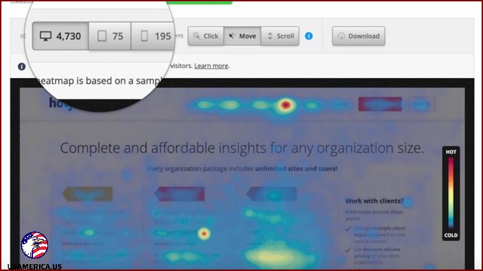
Now, let’s talk about Hotjar.
I want to tell you about Hotjar, a super cool tool that helps me keep track of what people do on my website. It’s all in the cloud, so I can access it from anywhere and get valuable insights into how my visitors are behaving.
With Hotjar, I can see where people are clicking, tapping, and scrolling on my site. It’s like I can read their minds and understand what they want! This helps me make changes and improvements to my website to make it even better for my visitors.
But it doesn’t stop there! Hotjar also gives me other awesome features to optimize my site. I can watch video recordings of people interacting with my site, so I can see exactly what they’re doing. I can analyze forms to see if people are having trouble with them. And I can even create polls and surveys to get direct feedback from my visitors!
Now, let’s talk about heatmaps. They’re like magic! Hotjar’s heatmaps show me where people are clicking, tapping, scrolling, and moving their mouse on my site. It’s like a secret map that tells me exactly what areas of my site are getting the most attention. This helps me figure out what changes I need to make to improve my website or applications.
Now, I know what you’re thinking – how much does Hotjar cost? Well, the starter plan is $89 a month and gives me analysis of up to 20,000 page views per day. That’s a lot of data to work with! But if you’re just starting out or want to try it out first, they also offer a free plan. It comes with some limited reports, but it’s a great way to get started and process up to 2,000 page views a day.
Lucky Orange
The Lucky Orange package is like a treasure trove of information! It’s got heat maps, session recordings, funnel analytics, and polls to see exactly what users are doing on your website. You can find out all about the taps, moves, clicks, and scrolling they’re doing. And if that wasn’t enough, you can also segment and filter the data to get the specific feedback you need for planning your tests.
For just $10 a month, you can get started with Lucky Orange. This subscription gives you 25,000 page views and unlimited recordings every month. And if you want to try it out before committing, there’s a free trial version available for you to test the waters.
Now let’s talk about Mouseflow.
Mouseflow is another great tool for tracking user behavior. It tracks clicks, scrolls, movement, and attention on your website. It even keeps track of drop-offs, refills, blank submissions, errors, and more. But that’s not all! Mouseflow also lets you watch anonymized recordings of each visitor’s activity on your site. So you can really see firsthand what’s working and what’s not.
Starting at just $24 per month, Mouseflow provides a range of services to help you better understand your website’s performance. With unlimited page views and 2,500 recordings per month, you’ll have all the data you need to make informed decisions. And with different levels of service available, you can easily upgrade as your needs grow. Plus, there’s even a free trial version so you can test it out before committing.
Quantum Metric
If you’re looking to optimize your website and improve user experience, Quantum Metric is the tool for you. By using statistical analysis and machine learning, it can identify areas for improvement and highlight successful campaigns. With features like real-time cross-team synchronization, you can collaborate with your team and focus on the most impactful opportunities. While pricing isn’t fixed, Quantum Metric offers customized quotes to fit your specific needs.
Smartlook
So, let me tell you about Smartlook. It’s this really cool tool that can help you see exactly what your website visitors are doing. I mean, from the moment they first come to your site until they come back and actually make a purchase. It’s like having a front-row seat to their entire journey!
All you have to do is add the Smartlook code to your website, and bam! You’re all set. It’s super easy to integrate, trust me.
But that’s not all. Smartlook also gives you these amazing heat maps and session replays. These heat maps show you where people are clicking on your site, and the replays let you watch real sessions to see exactly how people are interacting with your site. It’s seriously mind-blowing.
And guess what? Smartlook also offers a free trial. So you can try it out and see how awesome it is before you commit. But trust me, once you see it in action, you’ll be hooked.
Oh, and did I mention the Starter Plan? It’s only $31 a month, and it gives you 75,000 session recordings and heat map solutions. That’s a crazy good deal, if you ask me.
Now, let’s talk about Zoho PageSense.
I’m here to talk about Zoho PageSense, a cool tool that can help you understand how people interact with your website. It’s like having a virtual microscope to examine your website’s performance and make improvements.
With Zoho PageSense, you can see where people scroll down on your web pages and where they spend the most time. It’s like peeking over their shoulders as they explore your site. This way, you can figure out what catches their attention and what doesn’t.
But that’s not all! Zoho PageSense also lets you filter reports and focus on specific groups of visitors. You can use Zoho’s ready-made categories or create your own custom filters to get even more specific information about your users.
If you’re a small business owner, Zoho has got you covered with their standard package. For just $17 a month, you can enjoy all the powerful features of Zoho PageSense. And with this plan, you can analyze up to 10,000 page views every month!
How to Check Out Heatmap Tools
When it comes to choosing a heat map tool, the key is finding one that focuses on behavior analytics and heat maps. It’s important to me that the tool records events and maps them to my buying journey without any unnecessary distractions. I want it to be easy to use for anyone.
Another crucial factor is how straightforward it is to sign up. I want a heat map tool that only requires a simple email address, password, and billing information to set up an account. Some tools require coding knowledge to integrate with websites, which can be a barrier for me. However, there are others that provide seamless integration through script installation, making it easy even if I don’t know how to code.
One of the most important things to consider is the value offered by the heat map tool. Some tools offer free trials, while others have expensive subscription plans. The key is to figure out which specific heat map tools your business needs. Do you need conversion funnel analytics or just basic web analytics? This way, you can avoid paying for features that you’ll never use.
Another option is to find a heat map solution that offers different plans based on your website’s monthly page views. The great thing is that there are many heatmap solutions that have free plans. You can try out one, two, or more solutions and decide which heat map is best for your business.
In Conclusion
I want to talk to you about something really cool called heat map tools. These tools are super helpful when it comes to improving your website and getting more people to take action. They show you where people are clicking, tapping, scrolling, and moving their mouse on your site. This helps you figure out what’s working and what’s not.
But wait, there’s more! Predictive heat mapping tools also come with a bunch of other useful tools that can help you understand your website even better. You can use them to keep an eye on where your website visitors are coming from, find any issues on your site, see how people are interacting with your site, track events, and even see how attractive your product pages are. These tools are packed with valuable insights for your business.